Using The Right Colors In Your Email Campaigns
Marketing is all about persuasive yet effortless communication and it is no secret that colors are an important part of the entire process. This stands equally true for your email marketing efforts as it has been long since we moved from text-only emails to colorful HTML email templates that resemble miniature websites. While progress is being made on creating Mailchimp and Pardot HTML email templates that provide near website functionalities, your color scheme remains the single most effective visual communication strategy as an email marketer.
Colors have been subject to psychological and clinical studies for decades and every brand on the planet emphasizes harnessing the power of colors to resonate with their customers. For instance, almost every food chain in the world tries to bank on the yellow and red combination.
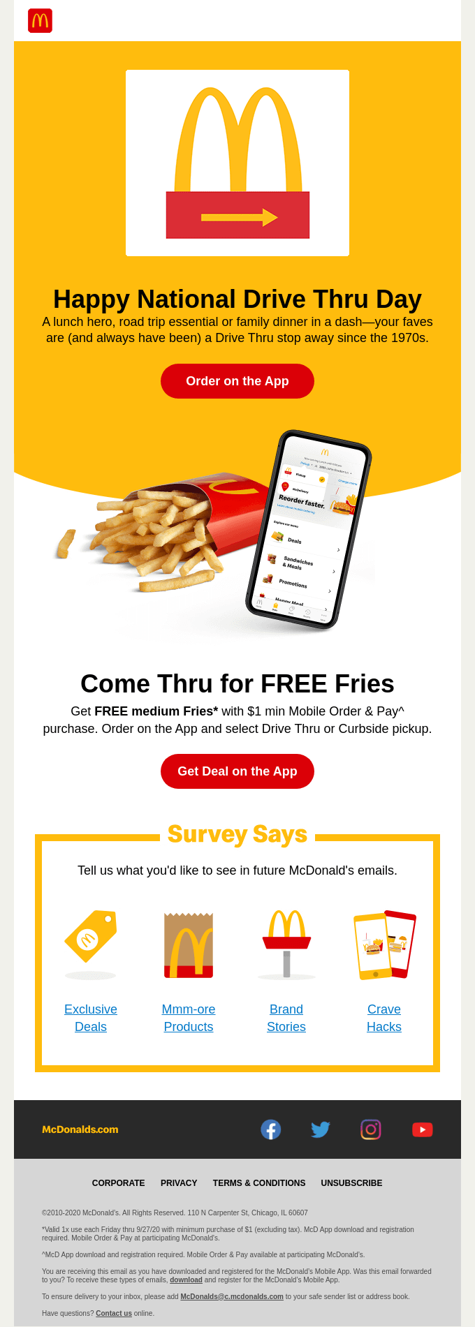
The color red is a trigger for appetite and it also attracts attention while the yellow color signifies friendliness and warmth. In this article, I will walk you through the nitty-gritty of using the right colors in your email campaigns like a pro. Let’s get started:
Understanding The Role Of Color Psychology In Emails
Ask any seasoned email marketer and they will tell you that color plays an important role in the association process and other psychological responses to digital entities like email.
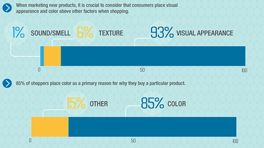
(Image Credits)
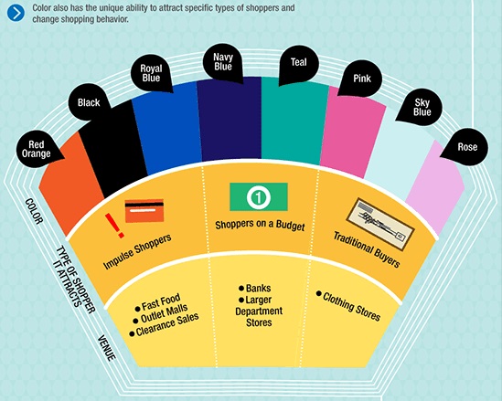
(Image Credits)
Depending on the purpose of the email, your brand colors, and your ideal customer persona you must select the colors that are in line with the parameters mentioned in the above infographics. In most cases, color psychology is taken care of during the brand building process of any company and more or less, the same is used in their emails.
This color scheme also acts as the guiding force for your color selection exercise but at the same time, it must be understood that you may not be able to use your entire brand color palette in each message you send. Let us understand the basics of selecting a color palette for your emails in the below section:
Emulsify Your Brand Colors In Your Email Template Color Scheme
The main element of your email templates will be your brand colors but it is not the case every time. At times you might want to keep your brand colors as the base colors for your email templates and you might want to find an entirely different color palette that is compatible with your brand color scheme. Follow the below tips to ensure that your brand colors are properly emulsified in your email template color scheme:
Establish Your Goals
To begin with, you must have a clear understanding of what you want to achieve with the help of the color palette you use in your email template. If you want to increase brand awareness, it would be best to stick with your brand colors and other supplementary color schemes that easily blend in with your brand identity.
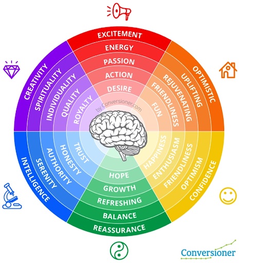
You can use the above color-emotion chart and implement A/B Split tests to see which color scheme works best for your sender’s intent. Based on your results, you may define the color scheme that works best for the given purpose. This will, in turn, help you develop a standardized email format for different sender intents which also helps recipients identify the purpose of the message.
Combining Colors
When combining colors for your email template, keep in mind that you would not want to use too many colors as it could make your design cluttered and distracting. To begin with, your use of colors should reflect a visual hierarchy and make it easy for the subscriber to consume the email. Stick with selecting colors from the opposite side of the color wheel to keep the color scheme complementary.
Also, ensure that your CTA button uses a rather vibrant color even if you are willing to go for a dual-tone color scheme. Ensure that you meet a high contrast throughout your email template color scheme but at the same time it shouldn’t consume more than the required screen weight.
Don’t Forget Readability
Often, email designers get carried away with the color scheme and completely forget about keeping the overall email readable. This can lead you to a situation where you need to read your entire email template and start from scratch as you cannot compromise your message’s readability.
One of the simplest and easiest ways to effectively dodge such situations is implementing Color Universal Design (CUD) as a part of your email design strategy. It helps keep your color scheme in line with readability best practices and it also helps you implement best practices like using high contrast and making your email designs compatible for people with different types of color blindness.
Summing Up
Using the right color scheme in your email templates is more about understanding what you want your messages to achieve than solely focusing on aesthetics. As an email marker, this single point can help you improve your designs drastically as you will be able to put color psychology on your side. Also, I would like to recommend you consistently evaluate how your subscribers react to different color schemes and tweak your designs accordingly. In the end, you want to prioritize color schemes that make you relevant to your subscribers and vice versa.


